Example Consultation Document
Chapter 7 - Image Accessibility
How to make an image accessible
Including images is a really easy way to break up monotonous text, however whenever we include images we must first consider its impact on accessibility.
What is accessibility?
Accessibility rules and guidelines are designed to ensure that content on the web is truly inclusive and that everybody, can use and access it. Just as a building can have alterations to ensure everyone can access it, certain alterations can be made to online content to ensure it is accessible to everyone too. The Web Content Accessibility Guidelines (WCAG) recommend avoiding images of text where the text needs to be read by users. For example, the user will be expected to need to read the text of an infographic but not the text of a logo. If the image is of a small amount of text an alternative text attribute can be added to the code and this must match the text in the image exactly; but if the image contains more than a short sentance or so, the text should also be elsewhere on the page.
How accessibility helps users
Editors, developers, and designers should consider screen reader users when working with images. Screen reader users include people who are blind, have low vision or cognitive impairments. Effective text alternatives should be provided to webpages, so that when screen readers encounter an image, they can read the alternative text instead. This is not only useful for users when the image doesn't load (and the alt text is provided instead), but also for users with cognitive impairments as they may prefer to disable images from loading altogether. Likewise, images may fail to load if a user has a slow internet connection. In both cases, the browser will displays alt text for the image.
Users with motion sensitivity or epilepsy may not tolerate certain types of images well and thus there may be issues with moving, flickering, or automatically animated images, including GIFs.
Additionally, visually impaired users may often zoom in on pages and enlarged images can appear pixelated and difficult to understand. Colour blind users benefit when high colour contrast is used for everything, including text and images.
Best practices
- Having good colour contrast and other design elements to help colour blind users. There are many webpages that allow you to determine the colour contrast and if it is an accepted contrast ratio.
- Text in images should have larger text to mitigate pixelation if zoomed in. A minimum size of 19px is a good rule of thumb, with larger being better. Text in images should match color contrast ratio minimums. For example, text that is at least 24px and normal weight (or 19px and bold) should use a contrast ratio that is at least 3:1. Ideally, use a contrast ratio that is at least 4.5:1 wherever possible.
- Any images linked should describe the purpose of the link, rather than the describing the image.
- Where possible, Scalable Vector Graphics (SVG) could be used. SVG-format vector images can be rendered at any size without loss of quality.
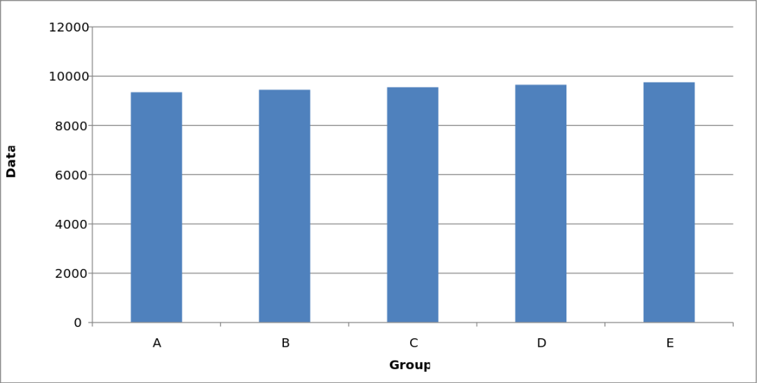
- Example: This SVG-format bar chart could be useful for people with low vision as they are able to magnify the chart without the image become pixilated and thus difficult to understand.
- Example: This SVG-format bar chart could be useful for people with low vision as they are able to magnify the chart without the image become pixilated and thus difficult to understand.
- Decorative images should have blank or empty alternative text as they are distracting to screen readers.
- Complex images must:
- Reiterate the information displayed.
- Provide alternative text or transcript that conveys the content in a way suitable for screen readers.
- Example: Below is a complex image describing JDi’s requirements for conversion documents. On the site where this is presented, there should be bullet points or paragraphs detailing the same information contained in the image.
If there is a lot of information contained within the image, your alternative text should direct the user to where the points are reiterated in the surrounding text. For example, with the following image we can provide an alternative text like "JDi's Document Conversion requirements, see below for details". The information must then be reiterated in the text below.
_thumb.png)
Infographics, charts, and other complex images
Image infographics, charts and graphs are very popular ways to express information with images. In order to ensure they can be understood by all users try to do the following:
- Use as little text as possible
- Use a large font size
- Meet colour contrast ratio minimums.
- For charts, graphs and infographics provide the same information in text form underneath the image.


